
15 Elegant Foyer Entryway Decor Tips to Impress Guests
You know that split second when someone walks through your front door and their eyes do a quick scan of your foyer? Yeah, that moment pretty much sets the tone for their entire visit.
Your entryway is basically the handshake of your home, and honestly, nobody wants a limp handshake.
I’ve watched countless guests pause in my entryway, and I can tell you from experience—the right decor makes them go “wow” before they even kick off their shoes.
Whether you’re working with a grand, sweeping foyer or a narrow hallway that barely fits your umbrella stand, I’ve got 15 killer ideas that’ll transform your space from “meh” to “magazine-worthy.” Let’s get into it.
Minimalist Marble Foyer Style

Ever notice how luxury hotels make everything look effortless? That’s the magic of minimalist marble styling, and you can totally pull it off at home without taking out a second mortgage.
I went the marble route in my own entryway last year, and the transformation still blows my mind. The trick is picking one statement marble piece—maybe a sleek console table or even just marble-look floor tiles—and letting it do all the heavy lifting. You don’t need to cover every surface in actual marble (trust me, your wallet will thank you).
Pair your marble element with clean lines and neutral colors. I’m talking whites, grays, and maybe a whisper of beige. Add a single sculptural vase or a minimalist mirror with a thin metal frame. The beauty here is what you don’t include—no clutter, no chaos, just pure sophistication.
Making Marble Work on a Budget
Here’s what I learned: marble-look alternatives have come a long way. You can grab marble-effect contact paper, ceramic tiles, or resin accessories that fool even your design-savvy friends. I picked up a faux marble tray from a home goods store for like $15, and people constantly ask where I got my “expensive Italian marble piece.” 🙂
The key details for this look:
- One focal marble piece (real or convincing faux)
- Maximum three colors in the entire space
- Geometric shapes over ornate designs
- Plenty of negative space
- One green plant for a touch of life
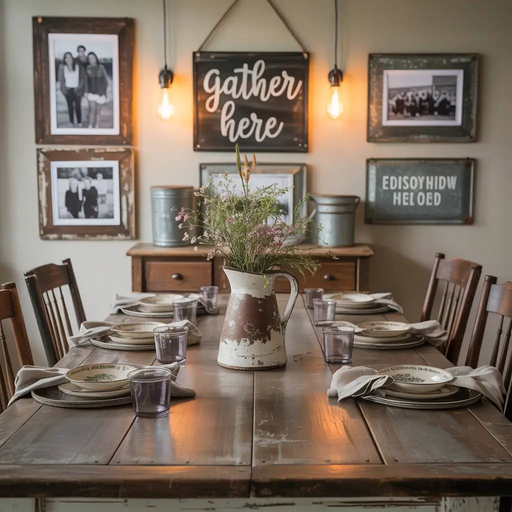
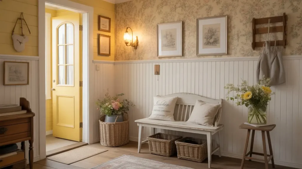
Rustic Farmhouse Entry Charm

Okay, so farmhouse style has been everywhere for a minute now, but there’s a reason it sticks around—it makes your home feel like a warm hug.
I transformed my sister’s cramped entryway with this style, and the difference was night and day. The rustic farmhouse vibe relies on natural wood textures and vintage-inspired pieces that look like you inherited them from your cool grandmother. Think distressed wood benches, weathered hooks for coats, and maybe a chicken wire basket (yes, seriously).
You want your guests to feel like they’ve stepped into a charming countryside cottage, even if you live in a fourth-floor apartment. Layer in some galvanized metal accents, burlap textures, and handwritten signs (but please, keep the “Live, Laugh, Love” stuff to a minimum—we’re going for authentic farmhouse, not Pinterest explosion).
Nailing the Rustic Details
The magic lives in the imperfections. I actually scuffed up a brand-new wooden bench with sandpaper and steel wool to give it that aged look. Worth it? Absolutely.
Essential farmhouse elements:
- Reclaimed or distressed wood furniture
- Mason jars repurposed as vases or storage
- Vintage metal hooks or coat rack
- Woven baskets for shoe storage
- Soft, neutral textiles like linen or cotton
Modern Glam Mirror Wall Foyer
Want to know the fastest way to make your entryway look twice as big and ten times more expensive? Mirrors, my friend. Lots of mirrors.
I installed a floor-to-ceiling mirror wall in my narrow entryway, and the transformation was borderline magical. The space went from “tight squeeze” to “grand entrance” overnight. Mirrors bounce light around like nobody’s business, making even the darkest foyer feel bright and welcoming.
The modern glam approach takes this mirror concept and cranks it up with metallic accents, crystal elements, and sleek furniture. Picture a gold-framed mirror (or three) paired with a glossy white console table and maybe a crystal table lamp. You’re creating that high-end boutique hotel vibe where guests wonder if they should’ve dressed up just to visit.
Mirror Placement Strategy
Don’t just slap a mirror on any wall and call it a day. I learned this the hard way. Position your mirror to reflect something attractive—a window, a piece of art, or an interesting architectural feature. Reflecting your pile of shoes? Not the move.
Key components for modern glam:
- Large statement mirror (oversized is better)
- Metallic finishes in gold, brass, or chrome
- High-gloss or lacquered furniture
- Crystal or glass accessories
- Layered lighting for drama
Boho Chic Textured Entryway
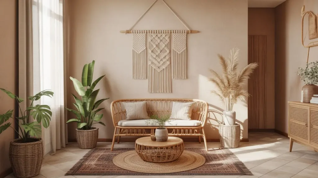
If minimalism makes you feel cold inside, the boho route might be your jam. This style celebrates texture, pattern, and that collected-over-time aesthetic that feels personal and inviting.
I helped my best friend create a boho entryway last summer, and honestly, it’s still my favorite project. We layered a vintage Turkish rug over her hardwood floors, hung a macramé wall hanging, and added rattan baskets for storage. The result? Pure cozy chaos in the best possible way.
Boho decor gives you permission to mix patterns and materials that “shouldn’t” work together. Throw a woven pouf next to a carved wooden bench. Hang beaded curtains alongside ethnic textiles. The more eclectic, the better—as long as you stick to a general color palette so things don’t veer into “thrift store explosion” territory.
Layering Like a Boho Pro
The secret to boho that looks intentional rather than messy? Strategic layering. Start with your largest pieces (rug, furniture) and build up with smaller textured elements. I always use the rule of three—three different textures minimum in any vignette.
Boho essentials include:
- Multiple textured textiles (macramé, woven, embroidered)
- Natural materials like rattan, jute, and wood
- Vintage or global-inspired accessories
- Plenty of plants in varied containers
- Warm, earthy color schemes
Classic Black and White Foyer Design

You know what never goes out of style? The timeless combo of black and white. It’s the little black dress of interior design—always appropriate, always chic.
I’ve used this palette in three different homes, and each time, guests comment on how polished everything looks. The beauty of black and white contrast is that it creates instant visual interest without requiring complicated color coordination. You literally cannot mess this up unless you really try.
Start with a black and white checkered floor (or a rug that mimics the pattern) and build from there. Add a white console table with black hardware, or flip it with a black table against white walls. Throw in some black-framed artwork and crisp white flowers in a black vase. Boom—instant sophistication.
Adding Warmth to Monochrome
Here’s the thing: all black and white can feel a bit sterile if you’re not careful. I learned to soften the look with natural textures—a jute rug, wooden accessories, or even warm metallics like brass. These elements keep the space from feeling like a chessboard.
Black and white basics:
- High contrast between elements for drama
- Patterns like stripes, checks, or geometric prints
- Mix of matte and glossy finishes
- One or two natural texture elements
- Crisp, clean lines throughout
Also Read: 15 Elegant Narrow Entryway Decor Ideas on a Budget
Cozy Cottage Foyer with Warm Lighting
Listen, not every entryway needs to scream “look at me!” Sometimes, you just want your guests to feel like they’ve come home, even if it’s not their home.
The cozy cottage approach focuses on warm, inviting lighting paired with comfortable, lived-in furniture. I’m talking table lamps with fabric shades, string lights, or even candles on a side table. The goal is making your entryway feel like the visual equivalent of hot cocoa on a rainy day.
I switched out my harsh overhead light for a vintage-style pendant lamp with a warm bulb, and the difference in ambiance was ridiculous. Suddenly, my entryway went from “gas station bathroom lighting” to “come sit and stay awhile.” Layer in some soft seating—maybe a cushioned bench or a small upholstered chair—and you’ve created an actual welcoming space rather than just a pass-through zone.
The Lighting Temperature Trick
FYI, bulb temperature matters way more than you’d think. I use 2700K bulbs (warm white) in my entryway fixtures because they create that cozy glow without looking dingy. Anything cooler than 3000K starts feeling institutional.
Cottage comfort elements:
- Warm-toned lighting (lamps, not just overhead)
- Soft, comfortable seating
- Plush textiles like cushions or throws
- Personal touches like family photos
- Wood furniture with a worn, loved feel
Coastal Breeze Blue Foyer Look
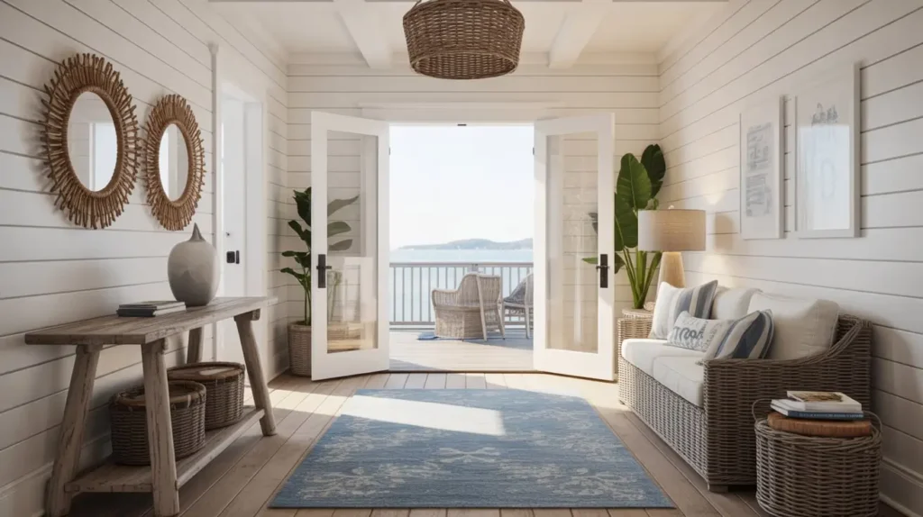
Want your entryway to feel like a perpetual vacation? The coastal aesthetic brings those breezy, beach-house vibes right into your home, and you don’t need to live anywhere near water to pull it off.
I created this look for a friend who lives in landlocked suburbia, and her entryway now feels like a Cape Cod cottage. The secret is layering different shades of blue—from soft sky blue to deeper navy—with crisp white and natural textures. Add some rope details, weathered wood, and maybe a piece of coral or driftwood, and you’re basically halfway to the ocean.
Keep the palette light and airy. Nobody wants to walk into a dark, cave-like entryway and pretend they’re at the beach. I painted one accent wall in a soft aqua and kept everything else white and natural wood. The effect is fresh, clean, and seriously calming.
Coastal Without the Clichés
Here’s my hot take: you don’t need anchors, ships’ wheels, or signs that say “Beach Please” to nail coastal decor. IMO, subtle nods to nautical elements work way better than theme-park levels of beach stuff. A rope-wrapped mirror? Perfect. A life preserver on the wall? Maybe dial it back.
Coastal style checklist:
- Blue and white color scheme with natural accents
- Weathered or whitewashed wood furniture
- Natural fiber rugs (jute, seagrass, sisal)
- Organic elements like shells, coral, or driftwood
- Plenty of natural light and white space
Vintage-Inspired Antique Foyer
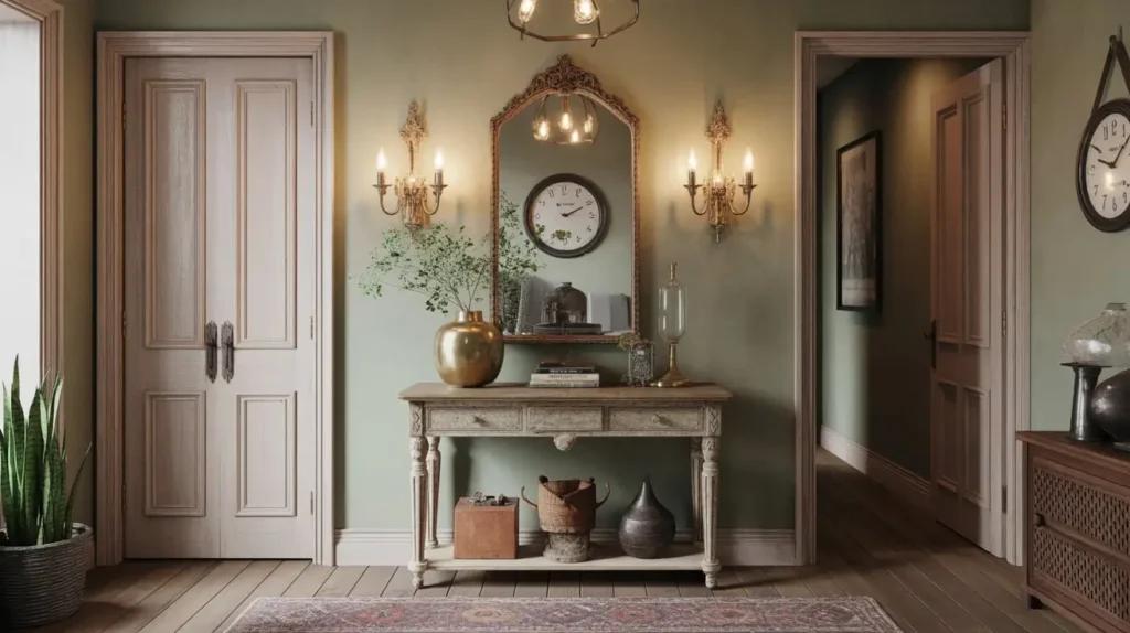
There’s something undeniably charming about walking into an entryway that feels like it has a story to tell. The vintage approach mixes genuine antique pieces (or really good reproductions) with timeworn finishes and classic design elements.
I scored an antique hall tree at an estate sale for $50, and it’s hands-down my favorite entryway piece ever. It’s got character, functionality, and that patina you just can’t fake. The vintage look works because it feels collected rather than decorated—like you’ve been curating these pieces for years.
Hunt for items with history: an old mirror with tarnished gilding, a worn leather bench, vintage coat hooks, or an antique umbrella stand. Mix in some aged brass accessories and maybe some old botanical prints in distressed frames. You’re creating a space that feels established and sophisticated.
Authenticity vs. Budget
Real antiques can get pricey fast, but here’s what I do: I mix one or two genuine vintage pieces with affordable reproductions and DIY aged finishes. Nobody can tell which is which, and your entryway still gets that authentic vintage soul.
Vintage vibes require:
- At least one genuine antique piece as a focal point
- Distressed or aged finishes on wood and metal
- Classic shapes and traditional silhouettes
- Muted, heritage color palette
- Vintage-style lighting fixtures
Scandinavian Light Wood Entryway
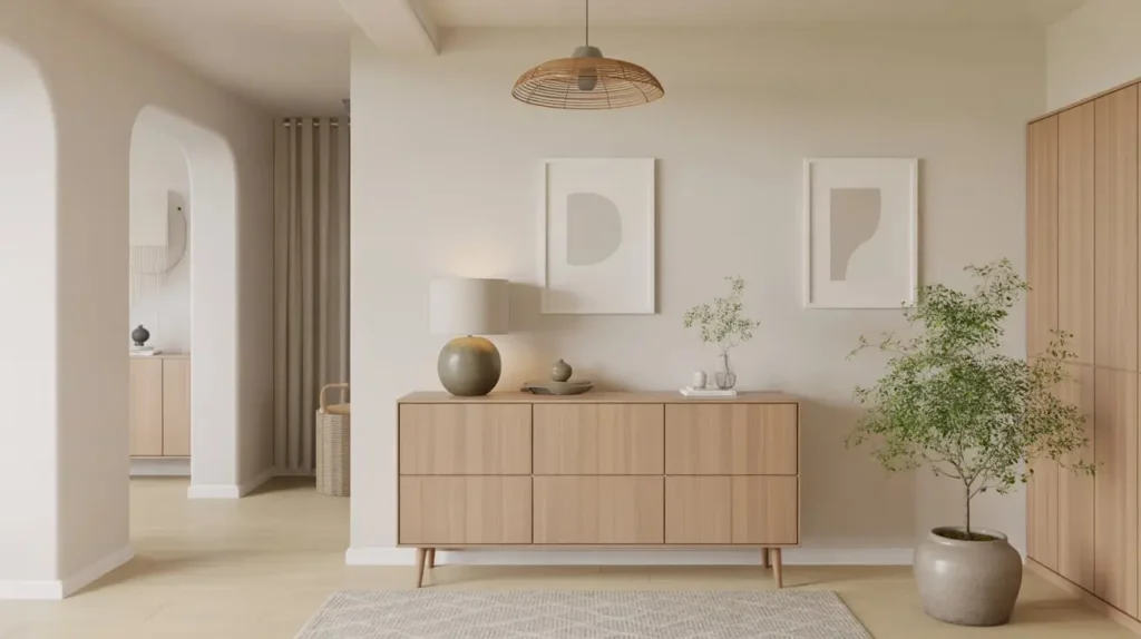
Clean, functional, and impossibly stylish—that’s Scandinavian design in a nutshell. This approach creates an entryway that feels organized and beautiful without trying too hard.
I renovated my entryway with Scandi principles last year, and the zen-like calm it brings me every single day is worth every penny. The foundation is light-colored wood (think blonde oak, birch, or ash) paired with white walls and minimal decoration. Every piece serves a purpose, and nothing feels excessive.
The Scandinavian philosophy centers on function and simplicity. Your entryway should work smoothly—hooks for coats, a bench for putting on shoes, maybe a small basket for keys. But all these functional elements should also look beautiful in their simplicity. No ornate carvings or fussy details, just clean lines and quality materials.
The Hygge Factor
Scandinavians have this concept called “hygge” (pronounced hoo-gah), which is all about coziness and contentment. You achieve this in your entryway by adding warm lighting and soft textiles to balance all that clean minimalism. I threw a sheepskin rug over my bench, and suddenly the space felt inviting instead of sterile.
Scandi essentials:
- Light wood furniture and accessories
- White or very pale walls
- Minimal decoration with maximum function
- Soft textiles in neutral tones
- Plants for a touch of life and color
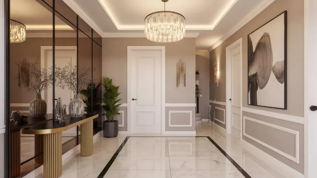
Luxe Gold Accent Foyer Decor
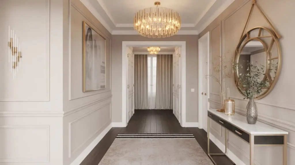
Want to feel fancy every time you walk through your front door? Gold accents bring that upscale, luxurious energy that makes even a regular Tuesday feel like a special occasion.
I added gold touches to my entryway gradually—a gold-framed mirror here, some brass cabinet pulls there—and the cumulative effect is chef’s kiss. The key is using gold as an accent, not the main event. You’re going for “subtle luxury,” not “King Midas had a meltdown.”
Mix your gold tones for depth. I combine brushed brass, antique gold, and even some rose gold elements. Pair these metallic accents with neutral backgrounds—white, gray, navy, or even black—so the gold really pops. Add in some luxe materials like marble, velvet, or glass to complete the high-end look.
Gold Finish Quality Matters
Here’s something I wish someone had told me earlier: cheap gold-tone finishes look, well, cheap. You don’t need solid gold (obviously), but invest in quality brass or gold-plated pieces rather than plasticky spray-painted stuff. The difference is visible from across the room. :/
Luxe gold checklist:
- Mixed gold tones for visual interest
- Quality metallic finishes (no plastic)
- Rich, neutral background colors
- Luxe materials like marble, velvet, or leather
- Balanced placement (not gold overload)
Also Read: 15 Graceful Church Entryway Decor Ideas to Inspire Worshippers
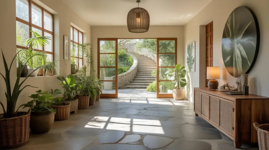
Nature-Inspired Greenery Foyer
Plants make everything better. That’s not just my opinion; that’s a scientific fact I’m pretty sure exists somewhere.
I turned my entryway into a mini indoor garden, and the air quality, aesthetics, and my mood all improved dramatically. The nature-inspired approach brings the outdoors in through strategic plant placement, natural materials, and organic shapes.
Start with plants that tolerate whatever light your entryway gets. I’ve got a mix of pothos, snake plants, and a fiddle leaf fig (because I’m basic like that, and I own it). Vary the heights—some on the floor, some on your console table, maybe a hanging plant if you’ve got the ceiling clearance. The layered greenery creates depth and makes your space feel alive.
Beyond plants, incorporate natural materials everywhere. Wood furniture, stone accessories, woven baskets, and natural fiber rugs all reinforce that organic, connected-to-nature vibe. Keep your color palette earthy—greens, browns, beiges, and soft whites.
Low-Maintenance Green Thumb Tips
Not all of us were born with plant superpowers. I killed approximately 17 plants before I figured out my entryway situation. Here’s the shortcut: choose plants based on your actual light conditions, not what looks good on Instagram. Snake plants and pothos tolerate low light like champions.
Nature-inspired must-haves:
- Multiple plants at varying heights
- Natural material furniture and accessories
- Earthy, organic color palette
- Textures like wood, stone, and woven fibers
- Maximum natural light or quality grow lights
Artistic Gallery Wall Foyer

Your entryway walls are prime real estate for making a statement, and a well-curated gallery wall delivers instant personality and visual interest.
I spent a whole Saturday planning my gallery wall layout on the floor before hanging anything, and that prep work paid off big time. The arrangement and spacing matter just as much as the art itself. You’re creating a cohesive display that draws the eye and makes guests want to look closer.
Mix frame sizes and styles for an eclectic look, or keep everything uniform for a more formal vibe. I prefer the eclectic route—black frames, gold frames, some with mats, some without. Include different types of art: prints, photographs, maybe a small mirror or decorative object. The variety creates visual rhythm that keeps things interesting.
The Gallery Wall Formula
Here’s my formula that never fails: start with your largest piece slightly off-center, then build around it. Maintain roughly 2-3 inches between frames. Use painter’s tape to map out your layout on the wall before you start hammering nails. You’re welcome for saving you from a million unnecessary holes.
Gallery wall requirements:
- Cohesive color palette across all pieces
- Varied frame sizes for interest
- Proper spacing (2-3 inches between)
- Mix of art types and mediums
- One anchor piece to build around
Small Space Floating Console Entry
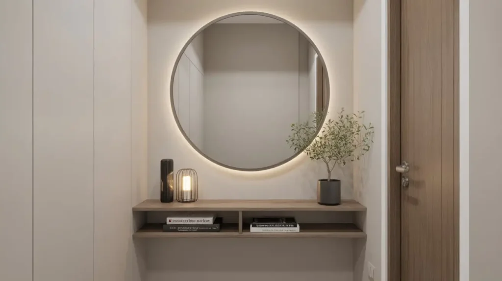
Got a narrow hallway masquerading as an entryway? A floating console saves precious floor space while still giving you that styled surface you need.
I installed a floating shelf with a drawer in my 3-foot-wide entryway, and suddenly I had functional storage without the space-hogging bulk of a traditional console table. Floating furniture creates visual airiness because you can see the floor beneath it, making the space feel larger than it actually is.
Mount your console at the right height—typically 30-32 inches from the floor—and style it like you would any console table. Add a mirror above to enhance the spacious feeling. Use the surface for a catch-all tray, a small lamp, and maybe one decorative object. Keep it minimal because small spaces can’t handle clutter.
Underneath, you’ve got open floor space that you can use for a slim basket or just leave empty to maximize that airy vibe. The whole setup takes up maybe 12 inches of depth instead of the 18-24 inches a traditional table would require.
Mounting Like a Pro
Real talk: use proper anchors rated for your wall type, or your floating console will eventually stop floating and start crashing. I learned this by watching my neighbor’s shelf eat drywall. Learn from her mistakes.
Small space solutions:
- Floating console or shelf (12-15 inches deep max)
- Wall-mounted hooks instead of a coat rack
- Mirror to expand visual space
- Minimal styling and accessories
- Vertical storage solutions
Elegant Monochrome Foyer Design

Monochromatic color schemes create a sophisticated, pulled-together look that feels intentional and designed. You pick one color and explore all its shades, tones, and tints.
I went all-in on gray tones in my last apartment’s entryway—from pale dove gray walls to charcoal accents—and the depth and richness you can achieve with one color is seriously impressive. People assume monochrome means boring, but they’re wrong. The subtle variations create layers of visual interest.
Pick your base color (gray, blue, green, beige—whatever speaks to you) and gather pieces in different values of that color. Light walls, medium-toned furniture, darker accents. Add texture to prevent flatness: a nubby rug, smooth ceramic vases, rough wooden frames. The varied textures catch light differently, making your single color scheme feel dynamic.
The Accent Debate
Some designers insist you need a pop of contrasting color to make monochrome work. I disagree. You can add a single contrasting element if you want, but a truly well-executed monochrome scheme stands on its own. That said, if your space feels flat, one brass accent or green plant might be the fix.
Monochrome magic includes:
- One base color in multiple shades
- Varied textures to add dimension
- Mix of light and dark values
- Thoughtful use of patterns in your chosen color
- Optional single accent color (or not)
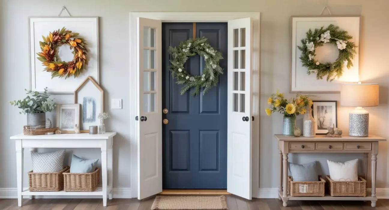
Seasonal Foyer Decor Transformation
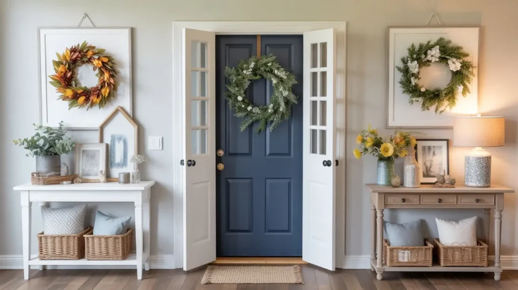
Here’s where you get to have some fun and flex your creative muscles throughout the year. A seasonal rotation keeps your entryway fresh and shows guests you actually care about your space.
I swap out small elements seasonally, and it takes maybe 20 minutes but makes a huge impact. You don’t need to redecorate the entire space—just switch a few key accessories to reflect the season. Spring might bring fresh flowers and pastel accents. Summer could mean bright colors and light fabrics. Fall introduces warm tones and cozy textures. Winter brings evergreen branches and sparkle.
The trick is having a neutral base that works year-round, then layering in seasonal touches. My console table, mirror, and rug stay constant, but I change the wreath on the door, swap the throw pillows on my bench, rotate in seasonal artwork, and adjust my accessories. These small changes keep things interesting without requiring a full renovation every three months.
I store my seasonal decor in labeled bins, so switching things out is actually easy rather than a whole production. Fall stuff goes in one bin, winter in another. When the season changes, I swap the bins in my storage closet. Simple system, maximum impact.
Budget-Friendly Seasonal Updates
You don’t need to buy expensive decor for every season. I make or forage a lot of my seasonal elements—branches from the yard, DIY wreaths, thrifted candlesticks I spray paint different colors. Nature provides free decor basically year-round if you know where to look.
Seasonal rotation tips:
- Neutral permanent base (furniture, rug, main lighting)
- Swap wreaths, pillows, and small accessories
- Incorporate natural, seasonal elements
- Store off-season items in labeled bins
- Budget-friendly DIY and foraged pieces
Making Your Foyer Work for You
Look, I’ve thrown a ton of ideas at you, and trying to implement all 15 would make your entryway look like a design identity crisis. The real magic happens when you pick the style that actually fits your life and your home.
I’ve decorated entryways in tiny apartments, sprawling houses, and everything in between. The consistent truth across all of them? Your foyer should reflect who you are and function for your actual daily routine. Love the coastal look but live in the desert? Who cares—do it anyway. Want to mix farmhouse with glam? Your house, your rules.
Start with function. What do you actually need your entryway to do? Store shoes? Hang coats? Provide a mirror for last-minute appearance checks? Build your design around those practical needs, then layer in the aesthetic elements that make you happy.
The best compliment I ever got on my entryway wasn’t “wow, this is so stylish” (though I’ll take that too). It was “this feels so you.” That’s what you’re going for—a space that impresses guests while also feeling authentically yours.
Your entryway is the first chapter of your home’s story. Make it a good one. Make it memorable. Make it so your guests pause for just a second, taking it all in, before they ask where they should put their shoes. That pause? That’s the sweet spot.